The Power of Paper: How Your Choice Sets the Tone

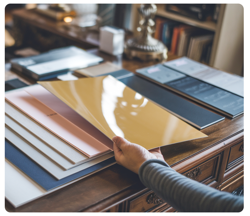
Paper is more than just a surface for printing. It has its own character. It can evoke warmth or coolness, brightness or subtlety, and feel earthy or extravagant. Let’s explore some essential elements that give each paper its own personality.
- Brightness Levels: Brightness indicates how much light reflects off the paper, rated on a scale from 1 to 100. A higher brightness (closer to 100) means your colors will stand out more vividly. Papers with lower brightness, particularly uncoated ones, tend to soften colors.
- Color Tones: Papers are available in a range of shades. A blue tint makes the colors seem cooler, while yellow undertones lend a warmer feel. Consider using a cooler-toned choice for your annual report and warmer tones when announcing your new summer collection.
- Textural Influence: The texture of paper can trigger strong emotional responses. Linen suggests sophistication, while cotton represents quality and formality. Recycled paper, mainly when it contains intentional imperfections, appeals to environmentally conscious clients. Smooth, glossy papers convey a corporate vibe.
- Finish Matters: Different finishes—glossy, matte, satin, and uncoated—affect how ink interacts with the paper. Uncoated sheets absorb ink for a more understated appearance, while high-gloss sheets make colors pop.
- Paper Weight: Papers are categorized by weight, with heavier sheets imparting a sense of importance. Opt for a heavier stock if you aim to project a premium or elite image. The thicker paper also suggests durability and longevity.
Selecting the right paper is akin to a striking smile or a warm gaze that establishes the mood for your message. Reach out to us for samples demonstrating how various paper styles can influence the conversations you want.


