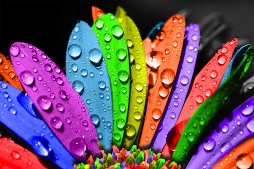
Full Palette Of Color
What Dictates the Meaning of Color?
When designing marketing materials, whether print or online, do you fall prey to the temptation to rely on traditional meanings for color? If it’s a luxury product, you use black. To bring excitement, you use red. If it’s a premium product, it must be gold.
While we do tend to associate colors with certain meanings, color also works like a palette. How those colors work together can be a more accurate reflection of the meaning those colors convey.
“For example, orange is seen as playful and youthful—think ‘Finding Nemo,’ but it can also be utilitarian (traffic cones and life rings),” says Jack Bredenfoerder color and marketing design consultant and Director of BV Color Strategy. “Red is associated with love and lusciousness, but it can also be a color of blood and carnage. Yellow is a happy color, but it can also mean caution (yield, caution signs). Green can represent fresh and natural, but when paired with different partners, the very same color can seem slimy and old.”
Cultural context dictates the perception of color, as well. In the United States, for example, white is associated with weddings, but in China, weddings are most often associated with red. Colors of state, colors of religion, and colors associated with professional sports teams, corporations, or colleges and universities also influence our perception of what certain colors mean.
So take a cue from the experts. When planning your next print or email project, step back from traditional perceptions. Think more broadly about the full palette of color and how the full array impacts the message you want to convey.
Drawn from “Tactics of Color Strategy” (PaperSpecs webinar February 2015)