Fonts Set a Tone & Shape a Story
Good typography equals good communication. We have thousands of typefaces to choose from. What does your choice of typography say about you?
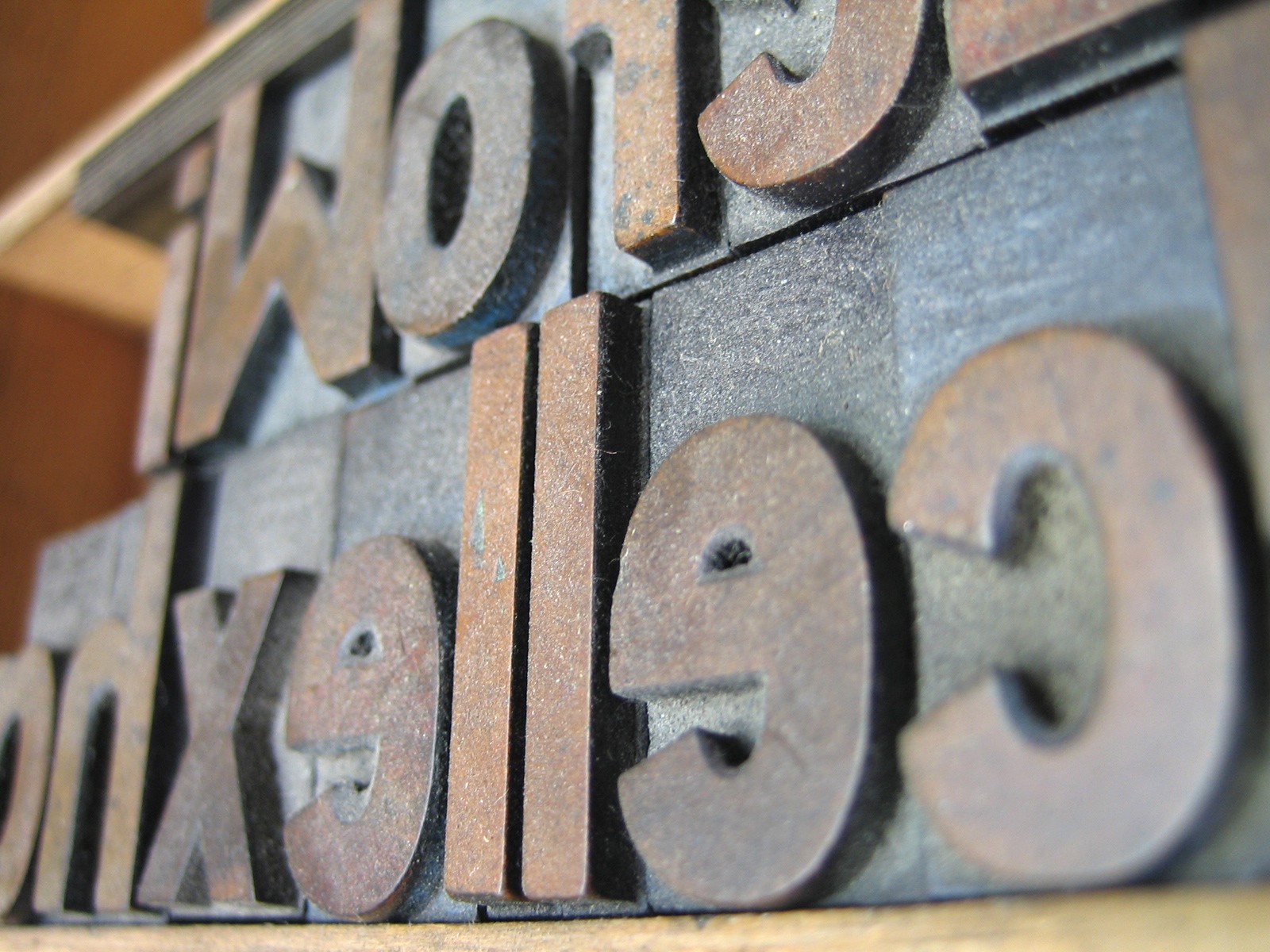
Historically, typographers designed almost all of the classic fonts for specific purposes. Let’s look at the history of some of our favorite fonts.
- Venetian book printer Aldus Manutius invented italic type not because he wanted to stress everything, but because it was the best way to fit all of a book’s text in a “pocket edition.”
- The British newspaper The Times commissioned the creation of Times Roman after font designer Stanley Morison criticized the paper for its poor typography.
- AT&T designed a popular sans serif face, Bell Gothic, in 1938 for its telephone directories. Its goal? Legibility and economy of page space.
- Charles de Gaulle International Airport developed Frutiger, another popular sans serif, for airport signage. The goal was for travelers to be able to quickly and easily read it from a distance.
- Highway Gothic, the official font of the U.S. Federal Highway Administration, spawned the creation of Interstate, the typeface used on highway signage. Typographers modified to use at smaller sizes.
- People who have never even seen a typewriter often use Courier, which was originally designed for IBM typewriters. It still evokes a homemade feel, even though few homes have typewriters anymore.
Type often obeys the law of engineering—form follows function. That is, a typeface should be appropriate to what the typesetter designed it to do. At the same time, fonts go in and out of fashion. The basis of good typographic design is balancing “logistical” requirements with what is pleasing and attractive.
Font choice affects the perception and reception of a document and is one of the crucial elements to good design. You should not treat it lightly. Every font tells a story. Is it the story you and your client want to tell?